

Making complex product information easier to compare
Tempur · Digital content, information design & responsive web design
I worked on digital content pages for Tempur, helping translate detailed mattress specifications and product information into clear, structured experiences. The work focused on making information easier to understand, compare and navigate across desktop and mobile.
The challenge
Choosing a mattress involves understanding more than just its size or name. Customers need to compare measurements, understand different materials and technologies, and work out which options best suit their needs.
The challenge was to present detailed product information without overwhelming the customer, making it easier to find relevant details and understand the differences between available options.
My approach
Organising information around customer questions
I worked on content pages that addressed practical questions customers might have when choosing a mattress.
The mattress size guide brought together standard UK sizes, metric measurements, imperial equivalents and practical considerations, such as whether a longer or wider bed might be more suitable.
By bringing these details together in a structured guide, the page made it easier for customers to compare sizes and find the measurements relevant to them.
Making product differences easier to understand
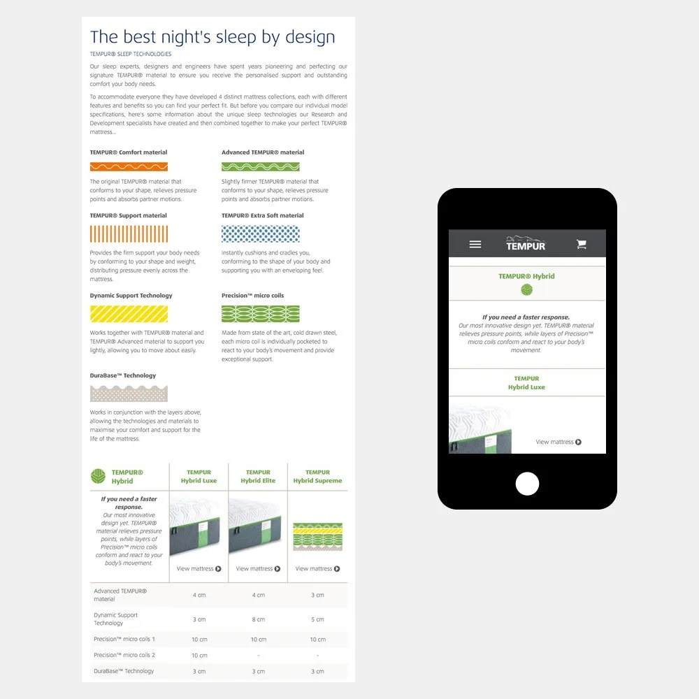
Tempur's mattresses incorporated different materials and sleep technologies, each with its own characteristics and benefits.
I helped present this information through clearly defined sections, explanatory copy and comparison tables. The aim was to make the details easier to scan and to help customers identify differences between mattress ranges without having to work through unstructured technical information.
Creating a clear visual hierarchy
I used headings, tables, supporting graphics and concise descriptions to give the information a clear structure.
This helped distinguish key details from supporting explanations, allowing customers to scan the page for specific information or read more deeply when they needed it.
Considering the mobile experience
The information also needed to work on smaller screens. I worked on responsive page designs so that detailed product content remained accessible on mobile as well as desktop.
The mobile examples demonstrate how customers could access the same essential information while browsing on a different device.
The thinking behind the work
The central consideration was how to make detailed information useful to someone making a purchase decision.
Rather than presenting specifications as isolated facts, the pages brought related information together and provided context to help customers interpret it. Comparison tables made differences visible, while explanatory copy helped communicate what those differences meant.
The work combined content and visual design to make complex information feel more approachable.
The outcome
The resulting pages presented mattress sizes, product specifications and sleep technologies in a more structured, comparison-friendly format across desktop and mobile.
The project demonstrates my approach to making detailed product information clearer through content organisation, visual hierarchy and responsive design.
My contribution
Digital content, product information structure, comparison-page design, explanatory copy and responsive digital design.